BIRMINGHAM SNOW HILL STATION SIGNAGE
[Source: Terry Callaghan]
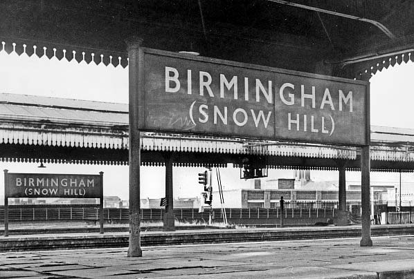
The pair of WR running-in-boards at the north end of the station captured in October 1970 having informed travellers since installation in the 1950s they were now living on borrowed time,
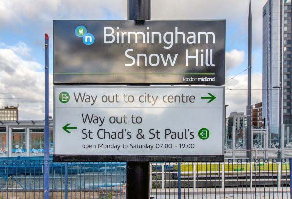
being removed within 12 months. Photo by John Mann 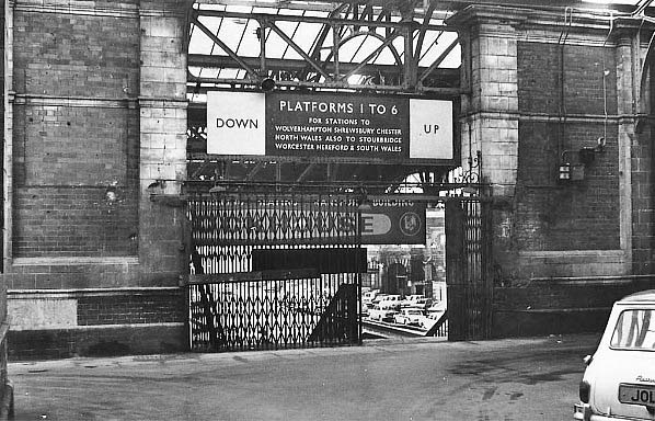 Snow Hill prided itself on being an efficient station and clear signage was seen as paramount to this. At the top of the staircase, from the booking hall, to platforms 1 to 6 not only are the destinations served by the platforms listed but which side of the stairs should be used is clearly displayed. Photo by Ian Baker  A Birmingham Snow Hill roundel-format totem from platform 7. This piece of railwayana was purchased for 10 Shillings and removed by a young trainspotter and his friend in 1967 in full view of some bemused passengers on a service to Leamington Spa. The only other station known to have been fitted with such signage was Bristol Temple Meads. Photo by Stephen Burdett from his Invader1009 Flickr photostream 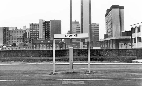 Standard British Rail ‘Corporate Identity’ signage was never fitted at Snow Hill. In its original 1965 form ‘Corporate Identity’ signs were on a plain white board with lettering in the ‘British Rail Alphabet’ devised by Margaret Calvert -inspired by Hoffmann and Miedinger’s ‘Helvetica’ (1957) and an evolution of Calvert’s font produced for NHS hospitals. When the station reopened in 1987 the 1960s/70s style of corporate signs had fallen out of favour and the version installed here has one of several fonts that have appeared in later BR and post-BR time. The new sign proclaims that travellers are arriving at Snow Hill; presumably they should already know that they are in the City of Birmingham. Photo by John Mann
|
 October 1970 and at the north end of the main up platform a WR running-in-board is pictured under the decaying platform canopy.
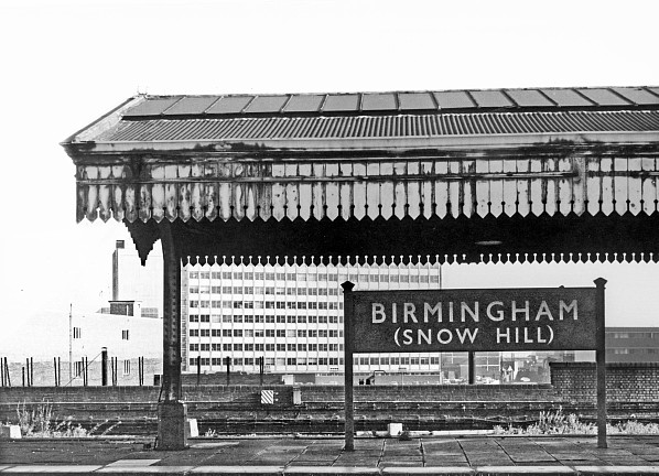
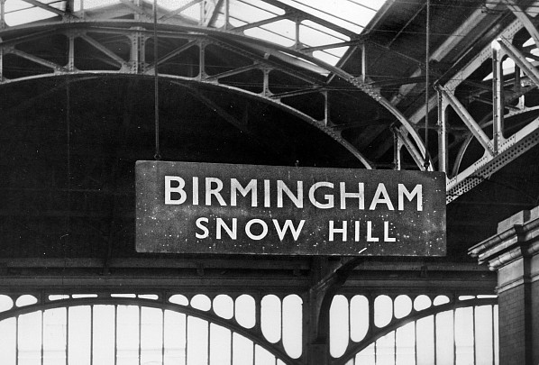 A rather pitted WR nameboard hangs from the station roof in October 1970. Unlike the previous example ‘Snow Hill’ is not in brackets.
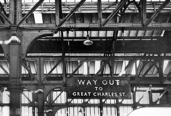 A WR ‘Way Out’ sign hangs from the roof girders in October 1970 directing passengers to the Great Charles Street exit.
 Looking from the main down platforms through to platforms 1 & 2 in October 1970 with a WR nameboard suspended over a Mini and Escort parked on the platform. The buildings of Livery Street can be glimpsed.
 Home Page